-
Posts
123 -
Joined
-
Last visited
-
Days Won
1
Posts posted by tractarian
-
-
44 minutes ago, renan said:
It is not the World Cup band on the upper deck. It is the band used by the local government to dress the stadium.
Thanks - I stand corrected.
-
18 hours ago, Oooswald said:
"We had a problem with the supplier. They're late. Some of the Look fo the Games will be installed later. We have a task force. We're working 24 hours. Some things will be installed later," said the operationals director of the Organizing Committee of Rio-2016.
The material came late to the country, imported from Eastern Europe for economy, and therefore being last minute placed on the venues. The Committee also believes that everything will be ready.

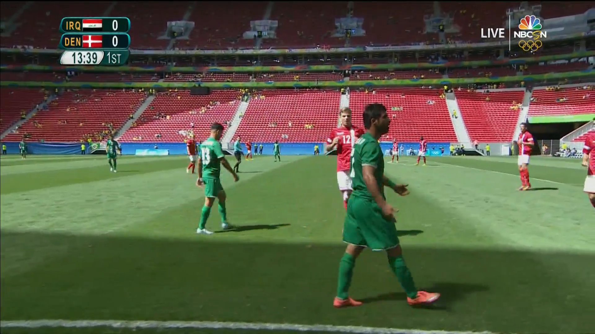
Story checks out - in Brasilia it looks like there is still 2014 World Cup signage on the upper deck!!!
-
The Atlanta opening ceremony was just an American version of Barcelona's. No new ideas, just bigger versions of the fantastic Barcelona ceremonies... Right down to the blue cloth on stadium floor . Atlanta copied Barcelona.
Hm. Well, Atlanta's OC did have the opening countdown on the big screen, the artistic segment, the parade of athletes, and a relay around the track featuring the final torch-bearers. So I guess they did copy Barcelona.
Wait - aren't those part of every Olympic OC?
I'll admit there were some similarities - but I might call "How Y'all Doin'?" an homage to Barcelona's "Hola" rather than an imitation. Anyway, are you really going to fault them for the color of the ground covering? Really? What color do you think would have been appropriate for Atlanta, would have looked good on TV, and also would have been original? Frankly, IMO, the blue looked a lot better than the dirt-colored covering in Sydney.
I have spoken to many IOC members who were highly disappointed with Atlanta- and it was because of Atlanta that Chicago came last in the bid to host the 2016 games.
Some IOC members were furious with Atlanta because of games-time logistics problem and overt commercialization (which, by the way, was shocking in 1996 because it was the first true post-Cold War, post-globalization Games - but now it's the norm and nobody complains). I seriously doubt Chicago lost out because of Atlanta's OC, which is what you're implying. It came in last because of the revenue dispute, period.


Evolution of Host Broadcaster/OBS graphics
in General Olympics Discussion
Posted
Here's a look at how the in-house graphics for the various host broadcasters have changed throughout the years.
Munich 1972. At the dawn of the computer age. No frills.
Montréal 1976. Not much to see here. Circular vignette-type effect used to superimpose an image over background.


Los Angeles 1984. Multiple colors used for the first time - and a deep drop shadow on everything. Wavy flag graphics also make their first appearance.
Seoul 1988. The deep drop shadow remains. Individual competitors' names appeared on a gray slab with a wavy flag.
Barcelona 1992. Now we're getting creative. No more drop shadow, and different color text for different purposes. Circular button-style flag icons. All over a light gray rounded rectangle base. Cobi signals that Mr. Ewing has fouled out.
Lillehammer 1994. A truly artistic approach, incorporating the look of the games and pictograms. Text presented in mixed case. Flag graphics accompanied by horizontally-aligned country code in yellow.
Atlanta 1996. White and yellow text presented in small caps over blue-green background with sublimated Olympic rings and look of the games. Flags combined with easily legible country codes. One of the most visually appealing packages, IMO.
Nagano 1998. Text in mixed case, with combined flag-country code graphics on multi-colored grid panels. Pretty.
Sydney 2000. Introduces standard graphics package that is used, almost unchanged, in 2002 and 2004. Simple grid format with white mixed-case text. Flags accompanied by itty-bitty country codes. Individual names over blue background, with Olympic rings omnipresent.
Salt Lake 2002. Pretty much identical to Sydney.
Athens 2004. Again, almost identical to Sydney. The country codes were made bolder and easier to read.
Turin 2006. The grid gives way to a more stylized, slanted approach. New typefaces used for top-line and second-line text. Everything is on a blue background.
Beijing 2008. In my view, the first graphics package intended primarily for HD. Oblique theme is retained from Turin, but the flags and country codes are more straightforward and upright. Fonts appear to be thinner, and surnames are capitalized. White numbers on red indicate rank; white on blue indicate start position. Look of the games sublimated into top-line background.
Vancouver 2010. Not much changes from Beijing. Custom top-line typeface is different, and names are now small caps for given names, capitals for surnames.
London 2012. Simple, slick evolution. The typefaces are unified - no longer are there five different fonts on one screen. Names are again small-caps/all-caps, and everything is slightly italicized. Olympic rings lose their color. Flag icons have 3-dimensional perspective. And everything is slickly animated.
Sochi 2014. Virtually identical to London.
Rio 2016. Most drastic evolution in years. The blue background becomes more of a dark teal/forest green. The text is *extremely* thin. Yellow text reappears, for uniform numbers, top-line titles, and country codes. The flags are flattened. Clearly no one is meant to see these graphics on a "standard-definition" television!